Sunday, March 29, 2009

So Very Saffron

Hi there,

well this is not the vintage-ish card I mentioned last post although it has a similar feeling. Hopefully I will be able to write that post soon. This card is in response to two challenges - fortuitously a sketch challenge from Mojo Monday and the latest colour challenge from Kristina Werner. Here's the sketch and the colour selections.


I had been thinking about the Mojo sketch all week and had already decided I wanted to use the flower from Touch of Nature, and when I saw Kristina's colours it was a perfect match. The card is basically So Saffron and Chocolate Chip, which turns out to be a lovely combo. I don't have Tangerine Tango so I used Pumpkin Pie instead and I have to admit, only a little to accent the centre of the flower. The flower I coloured using an aquapainter and my ink pads. Other points to note are the cuttlebug background (Floral Screen), ribbon, my new punch, Fyskar's (Cristina Re) Florentine and some DSP courtesy of Jayne Mercer (thanks).

I finished the inside off simply by punching down one side and then layering over some ribbon.


Recipe:
Stamps:
Touch of Nature, Warmest Regards
Card Stock: Chocolate Chip, So Saffron, watercolour paper
Ink: Timber Brown Stazon, Chocolate Chip, So Saffron, Pumpkin Pie, Going Gray
Accessories: Fyskar's (Cristina Re) Florentine border punch, aquapainter, wide double stitched Chocolate Chip ribbon, narrow Apricot Appeal grosgrain ribbon (but honestly its perfect match to So Saffron), Le Jardin DSP, Dimensionals, SNAIL adhesive, cuttlebug Floral Screen, So Saffron brads, 1/8" circle punch, Oval nestabilites and no embossing for a change.

Wednesday, March 25, 2009

Wildly suspenful

Hi there,

in retrospect, after my last post I decided that I wasn't all that happy with that card, and if I had the time to pull it apart I would have another go - but I don't so it will stand as is. Thank you to all the lovely ladies who did make such nice comments (I guess it can't have been too bad after all). I am however very happy with todays effort which is my entry this week for Makeesha's sketch challenge. Here's the sketch.


The design came to me at night (once again cuddling Mr1 to sleep). I have been wanting to try a suspension card for a while and the circle in Keesh's design seemed perfect for that. The next step was what to go in the centre- for some reason I thought of the penguin from Wild About You and that pretty much dictated the rest of the colours, and design elements (Blue Bayou, Bashful Blue, Whisper White and swirl cuttlebug. The sentiment, of course, had to be Wild About You !). The biggest challenge was trying to work out how I was going to cut a circle through all the layers (I don't have circle nesties (they are on their way though - yippee) my fall back was the Fiskars circle template and that ended up working OK. Final point to note is that there is penguin on both sides, one is Blue Bayou on White and the other is white embossed on Blue Bayou. So here's the card...


I do have another card finished at the moment, for a Mojo sketch from a couple of weeks back, in my first go at vintage -ish style, but won't get to post it till the weekend at the earliest. So till then...bye

Recipe:
Stamps: Wild About You
Card Stock:Whisper White, Blue Bayou, Bashful Blue
Ink: Blue Bayou, Versamark
Accessories: Punches (1 3/8, 1 1/4 circle, small oval), Fiskar circle template and cutter, white embosssing powder, heat gun, Pool Party DSP, Swirl cuttlebug folder, Blue Bayou double stitched ribbon, SNAIL adhesive, sticky strip, Dimensionals, Bashful Blue brads

Sunday, March 22, 2009

Happy Happy Birthday

Hi there,

well Kristina's colours initially had me stumped in this week's challenge. But I kept turning them over in my head, and eventually decided to try a mostly white background (all white did not work) and have little mixed and matched swatches of this weeks colours and just use black as an accent. First here are Kristina's colour picks for the week.


I went with a square card to balance the shape of the little square swatches and because of the pinks it had to be a girly card, so I wanted to add some extra girly touches - brads, ribbon, rhinestone, scallops. The final point to note is that the sentiment is black embossed (my first time using black !). Overall I'm reasonably happy with how it turned out, not perhaps my normal "style" so not bad for a first go.

Its a bit hard to see but all the panels are stamped with a little flower from Eastern Blooms, I stamped off once before stamping because I didn't want the flowers to dominate but given how light they are perhaps I shouldn't have. Live and learn. I haven't finished off the inside yet as I am only only to make the deadline by the skin of my teeth as it is.


Recipe:
Stamps:
Eastern Blooms, Birthday Whimsy
Ink: Pretty in Pink, Bashful Blue, Regal Rose, Versamark
Cardstock: Ruby Red, Pretty in Pink, Bashful Blue, Regal Rose
Accessories: Berry Bliss DSP, Black Embossing Powder, Heat Gun, Black brad, Circle Fire Rhinestone, Kaiser Pink Flower Rhinestone, Bashful Blue Striped Grosgrain ribbon, Black Gingham ribbon, SNAIL adhesive, Dimensionals, Scallop edge punch, Mat pack and piercing tool.

Thursday, March 19, 2009

Blooming Birthday

Hi there,

Sorry it’s been a while but our home and its inhabitants have had the full spectrum of colds and tummy bugs for the last week, thankfully now everyone is mostly on the mend.

So it was a very close run thing as to whether I would make Makeesha’s inspiration
challenge this week. Here is Makeesha’s inspiration image.


I came up with the layout idea in the middle of the night as I was cuddling my Mr1 back to sleep, the main elements being the three panels and inter weaved ribbon. As the inspiration photo has dark on light and light on dark panels in the bedding I wanted to reflect that, which is why I went with the white embossed blooms on the Not Quite Navy panels and stamped Not Quite Navy blooms on Whisper White. Basically it’s a fairly simple card, one reason why I had time to make it this week, and since I didn’t have time to fiddle I will say that the embossing is supposed to be patchy like that - really.

Overall I’m pretty happy with how it turned out, although if I’m honest I’m not 100% sure about the happy birthday label.


I just finished the inside off simply like this.


Recipe
Stamps:
Eastern Blooms, Birthday Whimsy, Looks Like Spring
Ink: Not Quite Navy, Versamark
Card Stock: Certainly Celery, Not Quite Navy, Whisper White
Accessories: White embossing powder, Heat Gun, Wide Certainly Celery Grosgrain ribbon, Blue Bayou striped grosgrain ribbon, Not Quite Navy brads, Scallop Edge punch, Corner rounder, Papercraft dimensionals, SNAIL adhesive

Tuesday, March 17, 2009

A blog award

Hi there,

well how exciting, this is my first blog award and comes from the lovely and very talented Kate. Thanks Kate XXX.


I want to pass this on to the lovely ladies who have supported my blog, publicly as followers and for commenting.

So here goes.

Sam Post
Makeesha Byl
Ruby Two Shoes
Bec
Belinda
Two Happy Stampers
Cathy (who doesn't have a blog yet but is hoping to have one up this year)

Thanks ladies I appreciate your support.

Saturday, March 14, 2009

A little something polka dot

Hi there,

I wanted to do Kristina's challenge this week as I decided to skip last week - and with a day to mull it over I had loads of ideas, I was trying to keep it simple, because I don't have alot of time to do the challenge. But this card turned out so much simpler than anything I had envisaged. When I opened up my stamp set cupboard my eyes fell on Polka Dot Punches and I just had a flash of an idea and decided to follow it through.

Firstly, these are the colours Kristina picked for this week.


While the card is simple, there are a few little touches that take time and points to note - I used Basic Grey and Basic Black markers to colour in the stamp, then at the end went over some of the dots with a clear glaze/aqualip pen. The sentiment is also stamped in versamark and then embossed in white. That about sums it up so here is the card.


I have thought about tinkering with it- ie adding more complexlity as that is what I naturally lean towards - for example you could punch out various layers of the stamp in black, white or gray and then mount them on dimensionals so the flowers/tree are more three-D but I don't have the time so I will have to leave it in what I hope is a state of elegant simplicity.


Recipe:
Stamps:Polka Dot Punches, So Many Sayings
Ink: Basic Gray, Basic Black, Versamark
Card Stock: Basic Gray, Whisper White
Accessories: Scallop Circle punch, White narrow grosgrain ribbon, white embossing powder and Heat Gun, Dimensionals, Snail Adhesive, Sakura clear glaze/aqualip pe
n

Wednesday, March 11, 2009

Paisley Petals

Hi there,

Makeesha set a colour challenge this week (sorry I can only get it to link to the whole blog today ? not the actually post). Here are the colours she picked.

I'm not quite sure why any more but for some reason I decided to go back to my Pick a Petal set - perhaps because its been all of three weeks since I've used it. On pondering - possibly in the middle of the night as we are still up every night with a coughing Mr 1 the thought occured to me to kiss the Paisley stamp onto the solid block petal - so thats what I did. Almost by accident I kissed the same spot and got the same flower motif - and that decided me to try repeating that on all the petals. You could almost say this card is a homage to a couple of our retiring backgrounds - Paisley and Linen, which actually only came into my possession yesterday afternoon - fresh from my retiring list order.

I have a very grumbly Mr 1 at my feet so I'm going to have to try to wrap this up quick. A couple of points to note - the petals are all clear embossed - very hard to see in the photos and the Linen background is also over sprayed on the edges with red marker using the colour spritzer tool.

The end of the petals are also up on double thick dimensionals as you can see below which really lifts them off the card.

Finally the is how I finished off the inside.


Recipe:
Stamps:
Pick a Petal, Paisley, Linen, So Many Sayings
Card Stock: Real red, Blue Bayou, Soft Sky, Whisper White
Ink: Real Red, Blue Bayou, Versamark
Accessories: Word window punch, 1" circle punch, Double thick dimensionals (from Kmart), 1" clear round button, Tombow Multi, Snail adhesive, clear embossing powder, Heat Gun, Scallop edge punch, Colour Spritzer tool and Real Red marker, Piercing tool, Clear Kaiser rhinestones

Monday, March 9, 2009

Autumnal thank you

Hi there,

I have a bunch of thank you cards to make at the momment and so I decided to use the latest Mojo Monday sketch to make my first. Here's the sketch for this week (gone).

I started by rifling through my DSP for Fall Flowers as I knew that had some lovely autumn colour in it (Autumn has just offically started down here in Aus, may'be thats why I had it on my mind - and in Canberra it begins early). I pulled out a stamp that said Autumn to me, from A Little Bit of Happiness, and then got down to some fiddly but fun work. Using my stamp-ma-jig, I always forget to mention this but honestly I couldn't work without it, I selected various elements of the horizontal stamp and inked up the bit I wanted with Stazon, stamped it and then repeated the process. After getting the central panel stamped I then paper tolled out selected bits of leaves from the two main DSP sheets - again fiddly but fun. A few final points to note are that the thank you panel and oak leaf down the bottom are lifted up on dimensionals, the oak leaf, main thank you and all the little "brads" (1/8" punched out circles) are coated with crystal effects. I was pretty happy with the end result - although I did wonder whether I should have sponged around the edges. Anyway here is the end result...


And here's a profile showing a glimpse of the inside as well as how various layers are up on dimensionals. Thats Mr 1 crawling around tin the background too.


Recipe:
Stamps: A Little Bit of Happiness
Card Stock: Really Rust, Soft Sky, Confetti White
Ink: Black Stazon
Accessories: Stamp-ma-jig, Fall Flowers DSP, Groovy Guava striped grosgrain ribbon, 1/8" circle punch, Dimensionals, Crystal effects, sanding block, Scallop edge punch

Wednesday, March 4, 2009

Little fish, little fish

Hi there,

well back with my last challenge for this week, although I have been trying to work on the next one today already. But back to this, as I don't have long, as my one year old is already fishing for the computer mouse. Next stop on his agenda will be to pull the computer plug out of the wall -its happened at least twice - arghhhh!

I had another birthday card to make, this time for a two year old boy, who lives up in Townsville in far North Queensland, and that led me to use Fishy Friends, for the layout I am playing along with Makeesha's latest
sketch challenge. This is the sketch


I went with Ballet Blue, Certainly Celery and Basic Gray as the colour combo (I've been wanting to try this combo after seeing a gorgeous card by Kate Lewis recently (and I thought the colours worked for a sea/fishy card). This was the result.


I tried to keep a watery feel by using a variety of texture, cuttlebug, white embossed bubble background, some dry embossed bubbles with the cuttlebug (on A2 settling), distressing, twill tape and hemp twine and finally some sparkle on the fishy - cause little boys like a bit of bling too.


Recipe:
Stamps:
Fishy Friends, Birthday Whimsy, Straight Up Alphabet and Numbers, Beyond the Basics
Card Stock: Ballet Blue, Basic Gray, Very Vanilla, Certainly Celery, Watercolour paper
Ink: Basic Gray, Ballet Blue, Certainly Celery (markers), Black Stazon
Accessories: Aquapainter, White embossing powder, Heat Gun, Cropodile, Cuttlebug Distressed Branches folder, Distressing tool, Twill Tape, Hemp Twine, Certainly Celery narrow grosgrain ribbon, Scallop Circle punch, 5-petal flower punch, 1/2 inch circle punch, 2-way glue pen, Dazzling Diamonds, Certainly Celery DSP, Dimensionals

Monday, March 2, 2009

H.M.A.S Welcome Baby

Hi there,

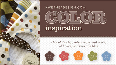
At first when I saw Kristina’s Werner’s latest colour challenge I wasn’t entirely sure how the colours would all go together but when I got all my card stock scraps out to start this card, I realized they make a great combination. As a colleague at work and his wife had just had a baby boy, and the inspiration photo was baby bibs I decided to stick with the theme and make a baby card. The colours are so bright and cheerful and came together to make, I hope, a fun card, celebrating the arrival of a new little boy. Here are the colours for this week.


Like my last Mojo card (scroll down to my last post) I made the background paper myself using Seeing Spots and Rivetting and the striped ribbon to echo the patterns on the baby bibs. I watercoloured the image with markers, ink pads and aquapainter. To make the ocean I used a small strip of cuttlebug, cut it to match the waves and sponged the top with white craft ink.


To finish the card I might use my Black Glaze pen to write in the babies name on the bow of the boat - but before I do that I want to check the spelling - it wouldn't be a good idea to get it wrong !

Recipe:
Stamps:
Boatloads of Love, Short and Sweet, Seeing Spots, Rivetting
Card Stock: Brocade Blue, Whisper White, Chocolate Chip, watercolour paper
Ink: Brocade Blue, Ruby Red, Pumpkin Pie, Old Olive, Chocolate Chip, White craft, Black stazon
Accessories: Pumpkin Pie striped grosgrain ribbon, Brocade Blue eyelets, Cuttlebug Distressed Branches folder, Large Oval and Word Window punches, Dimensionals, Snail adhesive, Aquapainter

Turning Four Mojo


Hi there,

sorry about the lack of posts for the last week, but between work, being a Mum and looking after a sick bubba (and the accompanying broken sleep at night) I haven’t had much time or energy. I have had a few cards in the works and this is the first one for the Mojo Monday 75 sketch.


I liked the sketch but definitely found it a challenge to organize and plan all the layers. I decided to use the sketch to make a birthday card for the daughter of an old friend who will be turning four soon. Having learnt already from my daughter that glitter and flowers are especially attractive to four year olds – I knew I had to incorporate both. I dug my Blooming with Happiness set out of the cupboard and using the Petals and Paisley paper as inspiration went forth and created the card below.


In the end I actually decided to make my own paper, stamping Whisper white card stock with Tempting Turquoise, So Saffron and Pretty in Pink, and combined that with the pink P&P DSP. The dress I watercoloured using marker and an aquapainter, once dry, I coated all the pink flowers and bodice in crystal effects and then using the two way glue pen added glitter to all the Turquoise and Saffron flowers. The flowers below the central panel, I clear embossed, added a pink rhinestone to and mounted on a dimensional. This photo shows some of that detail.


Recipe:
Stamps: Blooming with Happiness, Whimsical Numbers, Birthday Whimsy
Card Stock: Whisper White, Pretty In Pink, Tempting Turquoise, Watercolour paper
Ink: Tempting Turquoise, So Saffron, Pretty in Pink, Going Gray, Versamark, Black Stazon
Accessories: Scallop edge punch, 1 3/8, 1 ¼ and 1/8 circle punches, Tempting Turquoise and Pretty in Pink narrow grosgrain ribbon, Petal and Paisley DSP, Kaiser Pink Rhinestones, Clear embossing powder, Heat Gun, Dimensionals, Snail adhesive, Aquapainter