Hello there,
this week at Just Add Ink Kelly has asked us to Just Add Minimalist. Now minimalism is definitely not my style at all so this was a real challenge for me. Some guidelines I found useful were that minimalism often involves repetition of multiple images of same shape, simple geometric forms lines and squares and can be characterised by a monochromatic colour scheme.
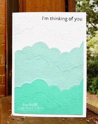
Taking that input in, this is what I came up with.
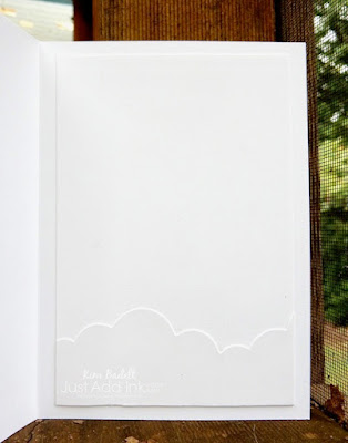
Aligning the die cuts was actually quite fussy. It sounds easy, but if you place the die at a slightly different angle across your card stock then it often won't align perfectly, especially on either end. Probably adding no embossed texture would have been more minimalistic but I had to add something to satisfy myself so I figured the uniform subtle rough texture was the best solution. Noting you need to stamp the sentiment first before you emboss.
This probably won't be my favourite project of the year, but it definitely stretched me, which a good challenge should do, and I learnt something about minimalism which was interesting. The Just Add Ink DT are showcasing a fabulous array of minimalist projects so please go check them out and then come back and join in the challenge.
Thanks for visiting,
Kim
Recipe: All SU! unless otherwise noted
Stamps: Art Gallery
Dies: Rainbow Builder (R)
Cardstock: Thick Basic White, Basic White, Pool Party Coastal Cabana
Ink: Tuxedo Black (Memento)
Accessories: Subtle embossing folder (R), Tear and tape, Big Shot die cutting machine (R)


No comments:
Post a Comment
Thanks so much for taking the time to comment!